The Art Section
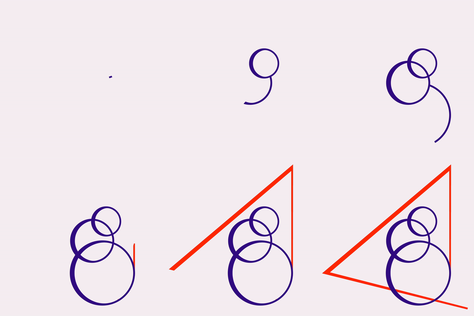
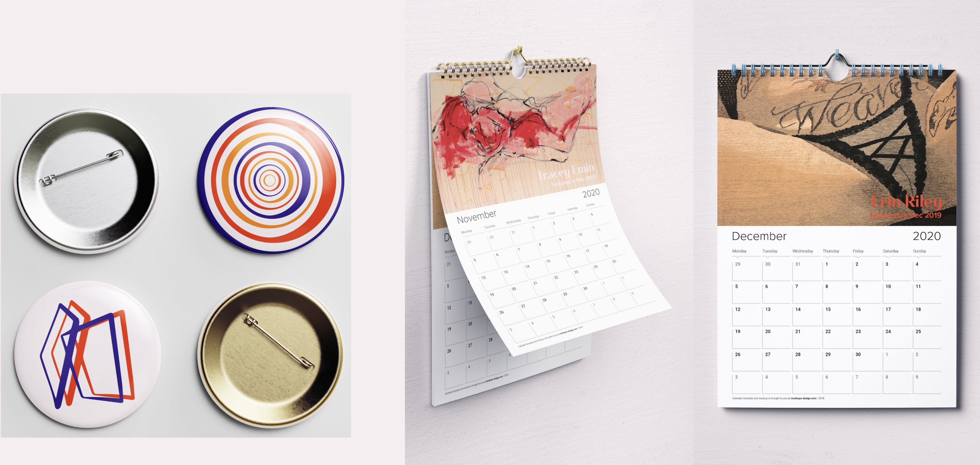
The Art Section is an online journal of art and cultural commentary. I used to intern for the Publisher and Editor in Chief, Deanna Sirlin, and work on the website. I know first hand that The Art Section was wonderful content but their branding is lackluster so I wanted to rebrand in a way that would bring more eyes to their content. I created an animated mark, five icons for different areas they cover, and mock up posters and merchandise.
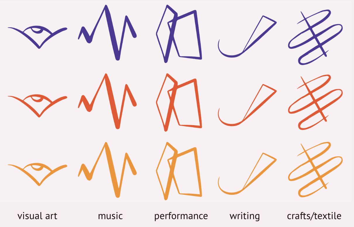
The mark is formed of 3 circles and a triangle to express the artistic process of creation. The circles represent thought and the triangle represents the physical manifestation of an artistic idea through visual art, music, theater, poetry, and more. Since The Art Section covers many different artistic media, it was important to have icons that represent these forms of expression and have the same contrasting and geometric visual language of the mark for a cohesive brand.


